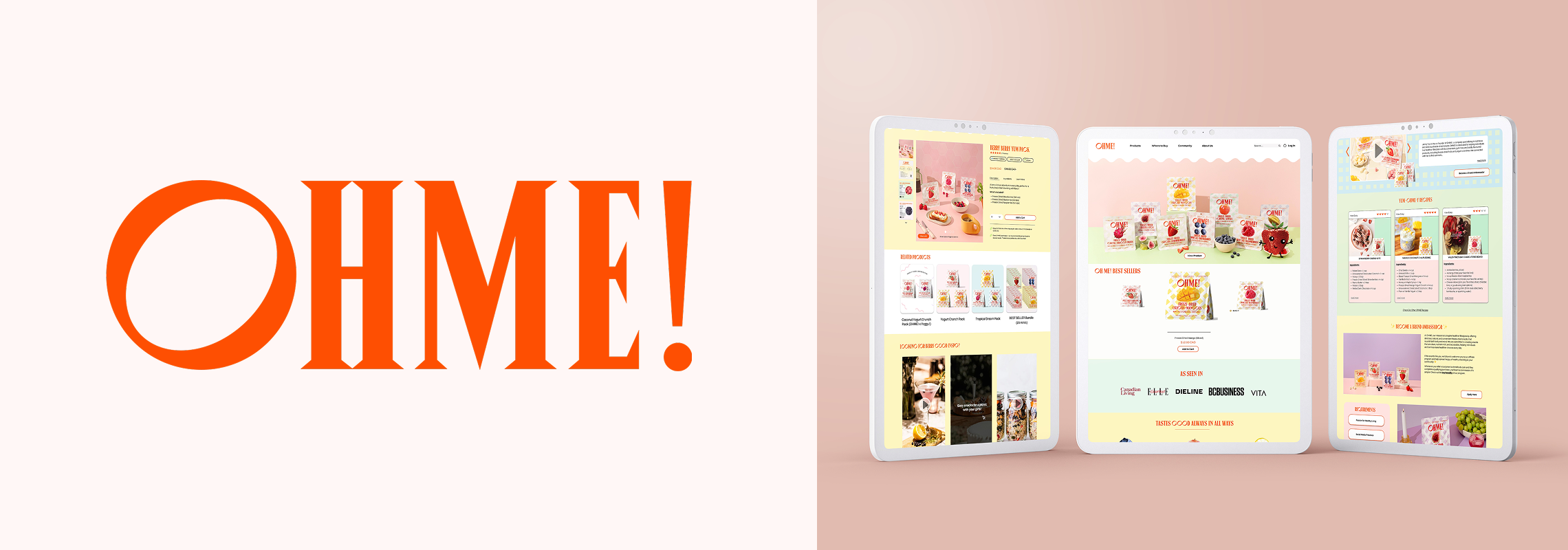
OVERVIEW
OHME! needed a website redesign to boost engagement, showcase products and drive sales. During a 72-hour hackathon, I revamped their site to align with their mission, enhance user experience and streamline the shopping journey.
Timeline: 72 hours (Flui Hackathon)
Team: 4 UI Designers
Toolkit: Figma
Role: As a UI Designer, I created wireframes to map out the website’s structure and user flow, designed high fidelity prototypes to enhance usability and visual appeal, and refined the visual design to align with OHME!’s brand.
Deliverables:
UX/UI
Branding and Visual Identity
Prototyping
Understanding the Problem
OHME! Foods needed a website refresh to improve customer trust, navigation, and conversions. The existing site had key challenges:
Lack of social proof – No visible testimonials or reviews, making it harder to build trust.
Cluttered navigation – Users struggled to find key products and information.
Unoptimized CTAs – Call to action buttons weren’t placed effectively, leading to lower conversions.
Design Process
Challenges with the Community Page (Before)
The community section is difficult to find, as it’s buried at the bottom of the page.
It’s only accessible through a product page, rather than having its own dedicated space.
Users have very few ways to engage or participate.

Limitations of the Recipe Section
Recipes are exclusively created by the company, preventing user contributions.
No options for users to submit their own recipes or interact with others.
The section feels more like a blog rather than a vibrant interactive community.

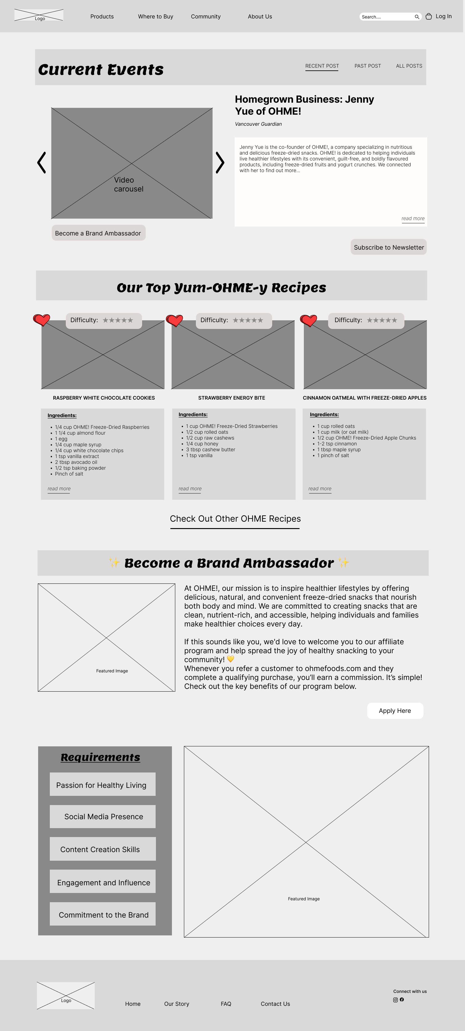
Low-Fidelity Wireframes: Community Page
To define the structure and functionality of the Community Page, I created low-fidelity wireframes. OHME! Foods aimed to enhance customer engagement by transforming the page into an interactive hub for users.
Key Features in the Wireframe:
Current Events Section – Highlights brand initiatives, campaigns, and customer stories to keep users informed and engaged.
User-Generated Recipes – Allows customers to share their own creative recipes using OHME! products, fostering a sense of community.
Brand Ambassador Program – Provides an opportunity for loyal customers to represent the brand and connect with others.
Low-Fidelity Wireframe
The Community section is now easily accessible from the main navigation.
Feature "Top 3 Popular Recipes" Highlighting the most liked recipes to drive engagement.
Launched the Brand Ambassador Program Encouraging loyal users to promote Ohme.
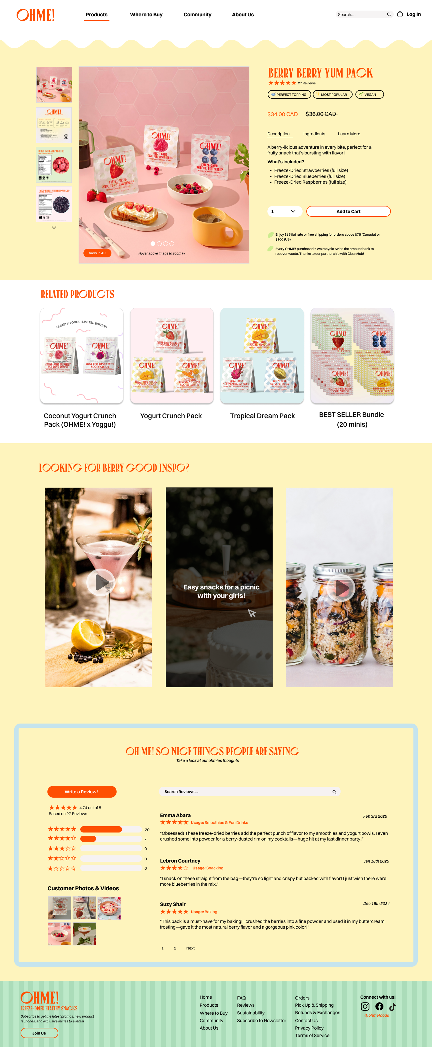
High-Fidelity Prototype
After refining the low-fidelity wireframes based on feedback, I developed high-fidelity prototypes to bring the design to life. This stage focused on visual design, branding, and usability enhancements to create an engaging user experience.
Key Refinements:
Improved Visual Hierarchy – Optimized typography, colour contrast, and spacing for better readability and a more intuitive user flow.
Consistent Branding – Applied OHME! Foods brand colours, icons, and imagery to maintain a cohesive and recognizable look across all pages.
Community Page
Current Events Section – Showcases brand initiatives and customer stories with engaging visuals and clear CTAs.
User Generated Recipes – Encourages community interaction by featuring creative ways to use OHME! products, with an easy submission process for users.

Product Page
AR Product Display – Introduces an interactive 3D slider that allows users to explore products in detail.
Shoppable Sections – Streamlines the shopping experience with clear product information, subscription options, and intuitive navigation.
Reflection & Conclusion
This project was a rewarding challenge, especially given the 72-hour constraint. I’m proud of how we incorporated interactive features like AR and created a design that reflects OHME!'s vibrant brand identity. The final prototype successfully addressed the client’s goals of improving customer engagement, driving sales, and creating a seamless shopping experience. We didn’t win but I gained friendships and had the chance to meet amazing participants and mentors!
Areas for Improvement:
If given more time I would focus on the following improvements to further enhance the user experience and overall effectiveness of the design:
User Testing & Iteration – Conduct usability testing with real users to gather insights on pain points, navigation efficiency and overall satisfaction.
Advanced Personalization – Implement AI-driven recommendations for products and recipes based on user preferences and browsing behavior.
Expanded Accessibility Features – Enhance accessibility with better screen reader support, higher contrast modes, and more inclusive design choices.
More Interactive Elements – Refine microinteractions, animations, and transitions for a more engaging experience.