OVERVIEW
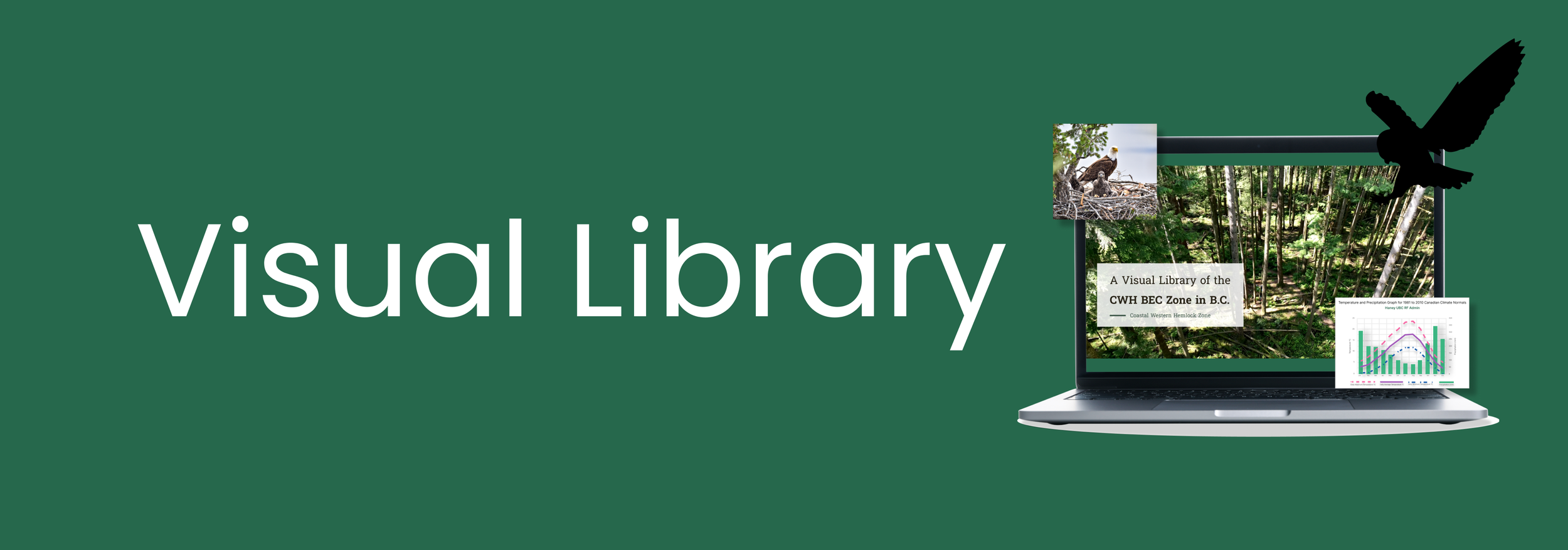
An e-book to guide to the diverse ecosystems of British Columbia's Coastal Western Hemlock (CWH) zone.
Timeline: 10 weeks
Team: 3 members
Toolkit: Figma, WordPress, Photoshop, Illustrator, After Effects
Role: As a UX/UI Designer and Front-end Developer, I redesigned pages and graphs for better readability and consistency, creating a smooth and interactive experience for students.
Tools:
Figma
WordPress
Photoshop
Illustrator
After Effects
Concept
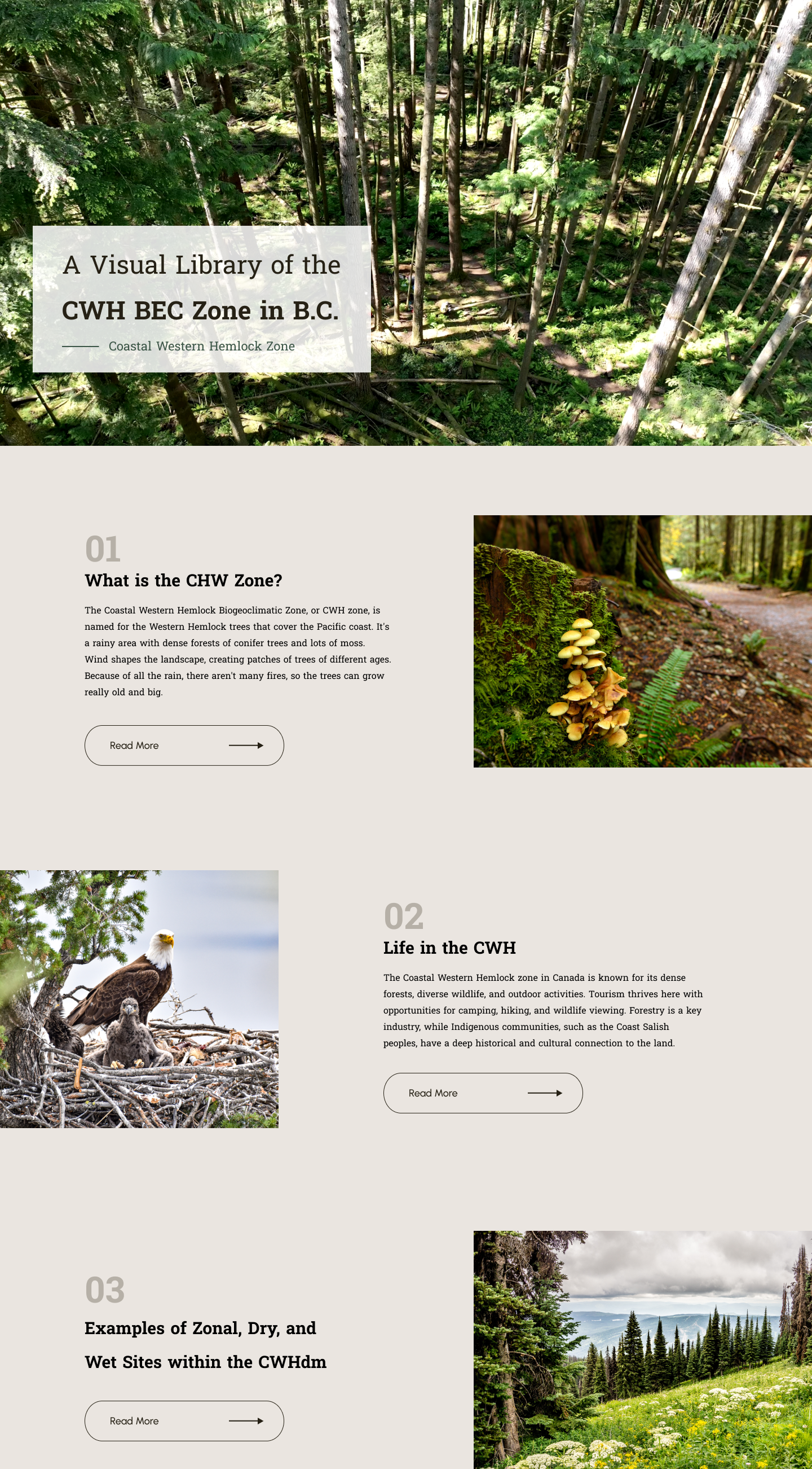
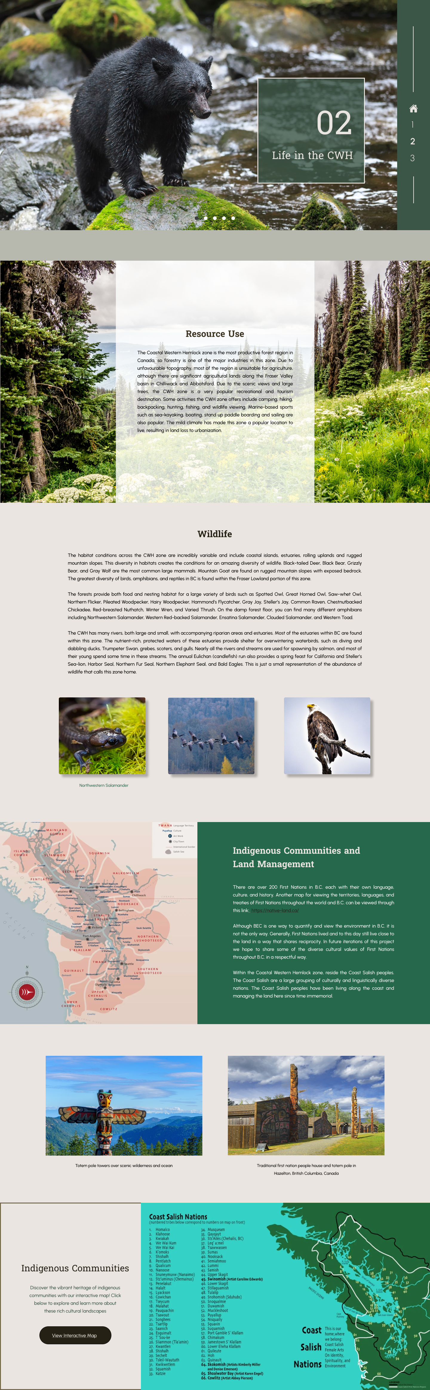
The Forestry Department at the British Columbia Institute of Technology required a comprehensive redesign of an old forestry textbook from the 1900s. This project involved converting the textbook into an interactive eBook format, updating its layout, and incorporating modern design elements while preserving its connection to nature.
The key concept behind this redesign was to introduce a "refreshing and accessible design" while maintaining the textbook’s focus on nature. It was essential that students did not feel overwhelmed by the dense content. This was achieved through the use of clean, spacious layouts, updated typography, and interactive features that made the content more engaging.
The overall look and feel of the redesigned textbook is modern, clean, and accessible. The color palette, fonts, and layout were all carefully chosen to evoke a sense of nature and professionalism. Custom illustrations and interactive elements were developed to enhance the learning experience while reflecting the textbook’s emphasis on natural sciences.
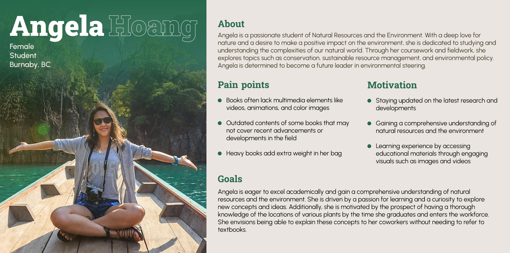
The goal of a user persona is to understand the background, needs, and frustrations of a typical user of the redesigned forestry textbook. This user persona reflects Angela a passionate student of Natural Resources and the Environment.
Angela is dedicated to studying conservation, sustainable resource management, and environmental policy. Her core needs include interactive content that simplifies complex forestry concepts and engaging visuals. The redesigned eBook provides clear explanations and easy navigation, helping Angela effectively grasp and apply the material in her studies and future career.
User Persona
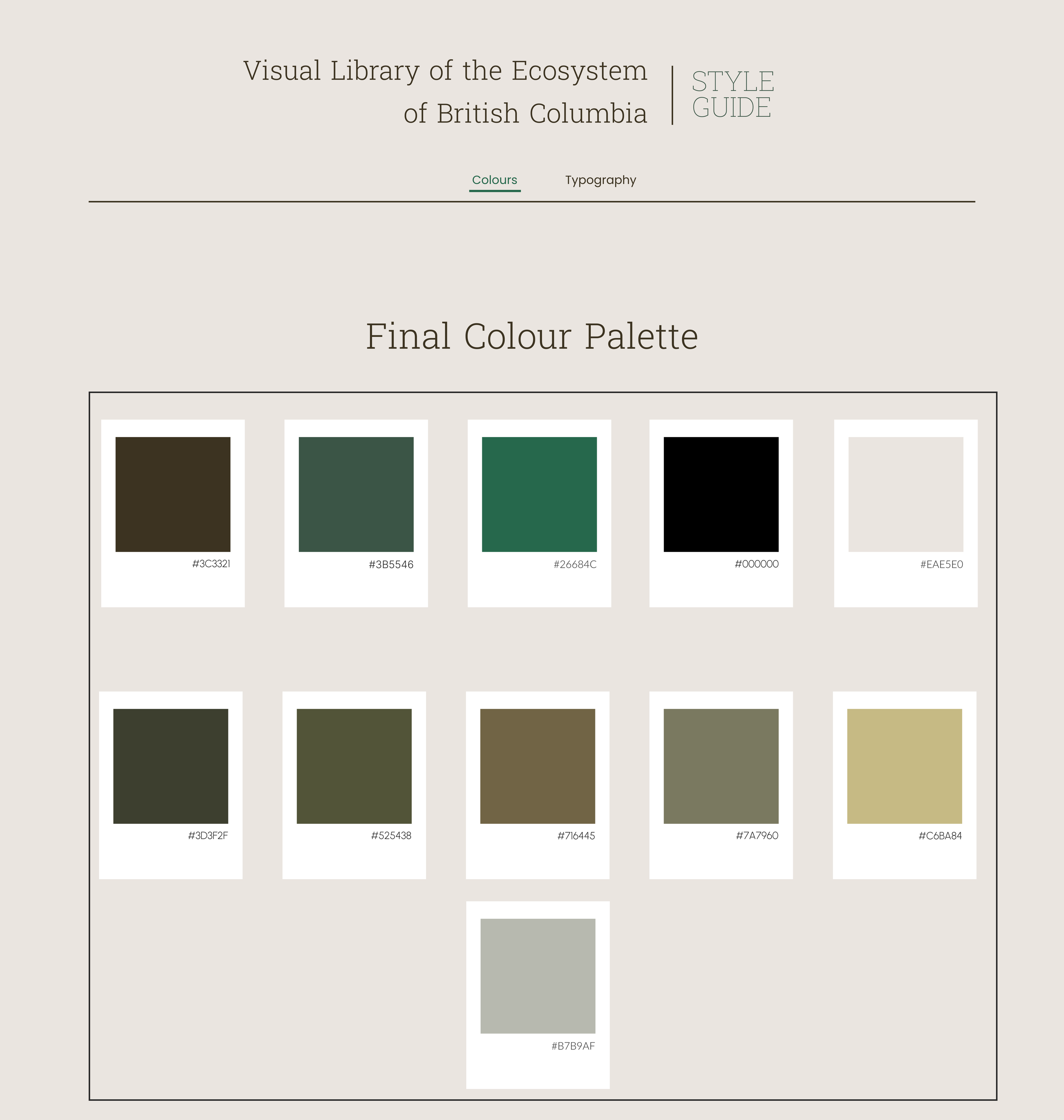
The feature color of the redesigned forestry textbook is a rich, earthy green, serving as a bold and grounding element throughout the design. This green reflects the natural themes of the content and provides a cohesive and inviting base for the eBook.
Complementary colors, including muted browns and soft neutrals, evoke feelings of calmness and a connection to nature important qualities for a resource centered on environmental education. These colors were carefully selected to create a harmonious and professional look, aligning with the textbook’s academic focus and enhancing the overall learning experience.
Colour Palette
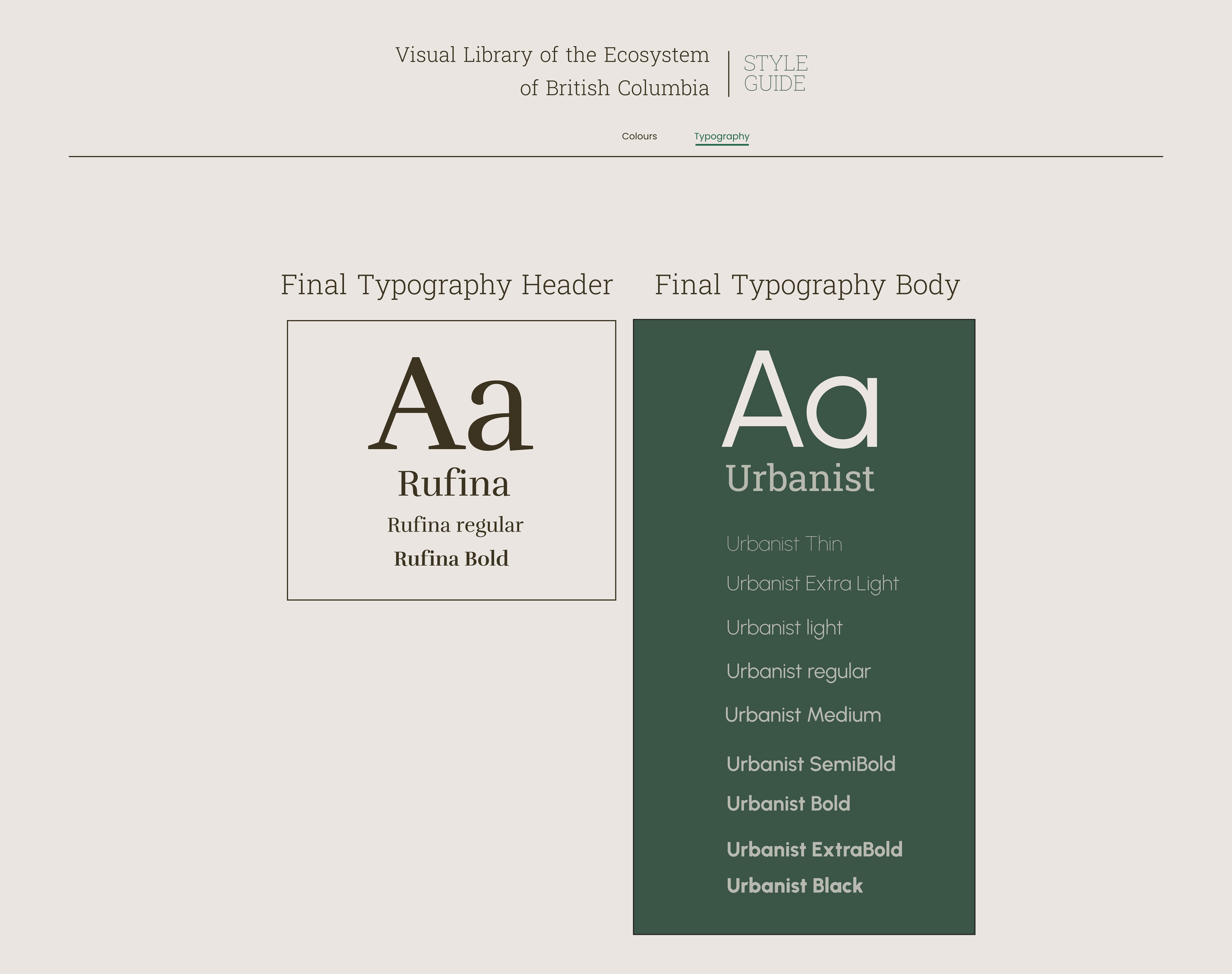
Heading Font
The chosen heading font is Rufina, a serif typeface that combines elegance with readability. Rufina’s distinct serifs and refined character make it a strong choice for headings, conveying a sense of professionalism and authority.
Body Copy Font
For the body text, Urbanist was selected. This versatile sans-serif typeface offers a wide range of weights, from Thin to Black, making it adaptable for various text sizes and styles throughout the textbook. Urbanist’s clean and modern design ensures readability, while its subtle nod to traditional forms keeps the content approachable and engaging.
Typography
The logo for the Visual Library of the Ecosystem of British Columbia was designed to reflect the natural beauty and diversity of the region. The logo incorporates elements that evoke a sense of connection to the environment, featuring organic shapes and earthy tones inspired by the local landscape. The design process prioritized creating a visual identity that feels both authoritative and accessible, aligning with the educational mission of the project.
Logo Design
Final Design
The final design incorporated feedback from four client reviews and independent testing, which significantly influenced the refinement of the prototype. A key focus was on recreating visual elements such as graphs, videos, and illustrations to ensure a cohesive and engaging design throughout the website.
One of the major updates was the addition of a video on the homepage. This video was strategically placed to immediately capture the user’s attention and provide an immersive introduction to the project. By incorporating this video, we enhanced the visual appeal and created a dynamic entry point that effectively communicates the project's mission and values. To view the final design, you can access the Figma file here.
In summary, my practicum involved developing an interactive eBook for the Forestry Department at BCIT using the institution’s WordPress content management system. I utilized CSS and JavaScript to customize plugins and achieve a unique design for the eBook. Despite the challenges posed by the limited selection of pre-approved plugins, meticulous planning ensured the design was both functional and engaging.
This approach not only met the immediate goals of modernizing the textbook but also established a strong foundation for future updates and refinements. The redesigned eBook is set up for easy maintenance and enhancement, allowing future students and contributors to build upon this work and continue evolving the resource as needed.